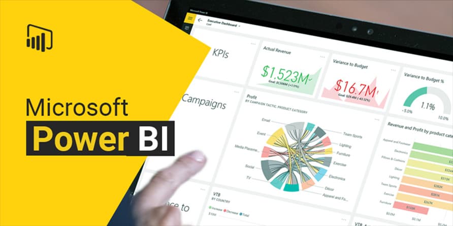
Microsoft Power BI Data Analytics and Visualization is an intermediate Data Analysis course delivered in person and online by SBEEH Software Academy in Amman, Jordan.
3 Days (24 Hours)
Last updated September 23, 2026
Main Topics:
Connecting to data sources (Excel, SQL, web)
Power Query: cleaning and transforming data
Star schema modeling
Relationships and cardinality
Detailed Subtopics:
Removing duplicates, splitting columns, and unpivoting data in Power Query
Fact tables vs. dimension tables
One-to-many vs. many-to-many relationships and cross-filter direction
Building a date table for time intelligence
Hands-On Lab: Connect to a sample sales dataset (Excel and SQL), clean and shape it in Power Query, and build a star-schema model with a proper date table.
Real-World Scenario: A finance team's current 'reporting' is a single flat Excel sheet with inconsistent formatting that breaks every time someone edits it.
Learning Outcome: Participants can connect, clean, and model raw data into a proper, query-friendly star schema.
Main Topics:
DAX fundamentals: calculated columns vs. measures
Aggregation and filter context
Time intelligence functions
Common business calculations (YTD, running totals, variance)
Detailed Subtopics:
CALCULATE and modifying filter context
SUMX and other iterator functions
Building YoY growth and YTD measures with time intelligence functions
Debugging DAX with the correct mental model of context
Hands-On Lab: Write a set of DAX measures on the Day 1 model to calculate year-to-date sales, year-over-year growth, and a running total, and validate the results against a manual calculation.
Real-World Scenario: Leadership wants to see year-over-year growth trends by region, which the current flat Excel report cannot calculate reliably.
Learning Outcome: Participants can write correct, non-trivial DAX measures for real business analysis, not just simple aggregations.
Main Topics:
Choosing the right visual for the data
Report design and interactivity (slicers, drill-through)
Publishing to the Power BI Service
Row-level security and sharing
Detailed Subtopics:
Common visualization mistakes and how to avoid them
Building drill-through pages for detailed analysis
Configuring scheduled refresh in the Power BI Service
Implementing row-level security so users see only their own region/department data
Hands-On Lab: Build an interactive multi-page dashboard from the Day 2 model, publish it to the Power BI Service, configure scheduled refresh, and implement row-level security so a sales rep sees only their own region.
Real-World Scenario: The finance director wants regional sales managers to have access to the same dashboard but each should only see their own region's data.
Learning Outcome: Participants leave with a complete, published, secured interactive Power BI solution built from raw data.
This course is for people who analyze and report on business data and want to move beyond static spreadsheets.
Business analysts and data analysts building self-service dashboards
Finance, operations, and sales professionals moving beyond static Excel reporting
IT staff supporting a Power BI rollout across an organization
Managers who need to interpret and configure Power BI reports for their teams
Basic data and spreadsheet skills are expected; no prior Power BI or programming experience is required.
Comfort working with data in Excel (formulas, pivot tables are helpful but not required)
Basic understanding of business reporting concepts (sums, averages, trends)
No prior Power BI or DAX experience required
No programming background required
Power BI Desktop installed for hands-on labs (guided setup on Day 1)
Upon successful completion of the training, participants will receive an official Certificate of Completion.
A look at our training sessions — hands-on training sessions with professionals across Jordan and the GCC.
Reach out and we'll help you plan the right training for your team.